UX CASE STUDY · PRODUCT DESIGN
Sending money
shouldn’t feel
uncertain.
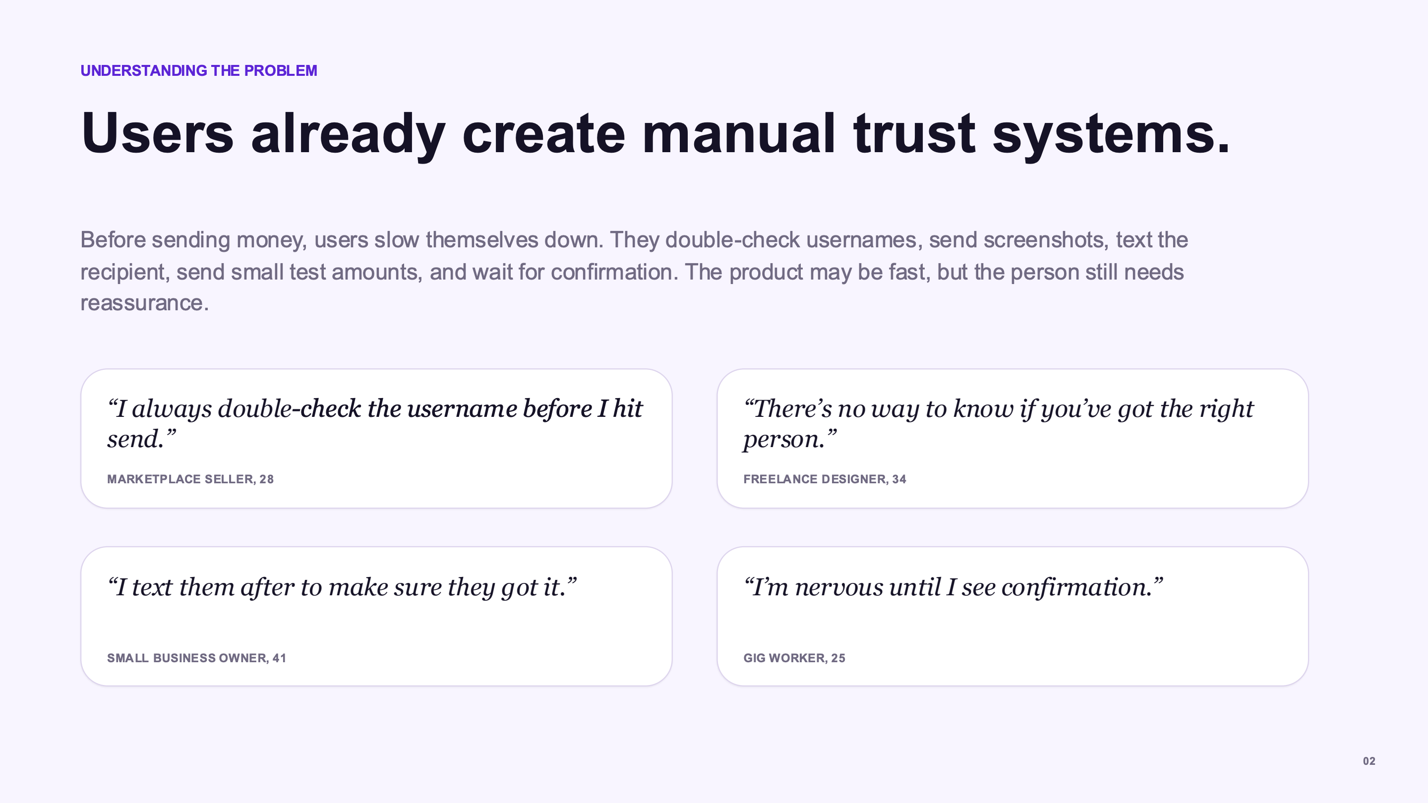
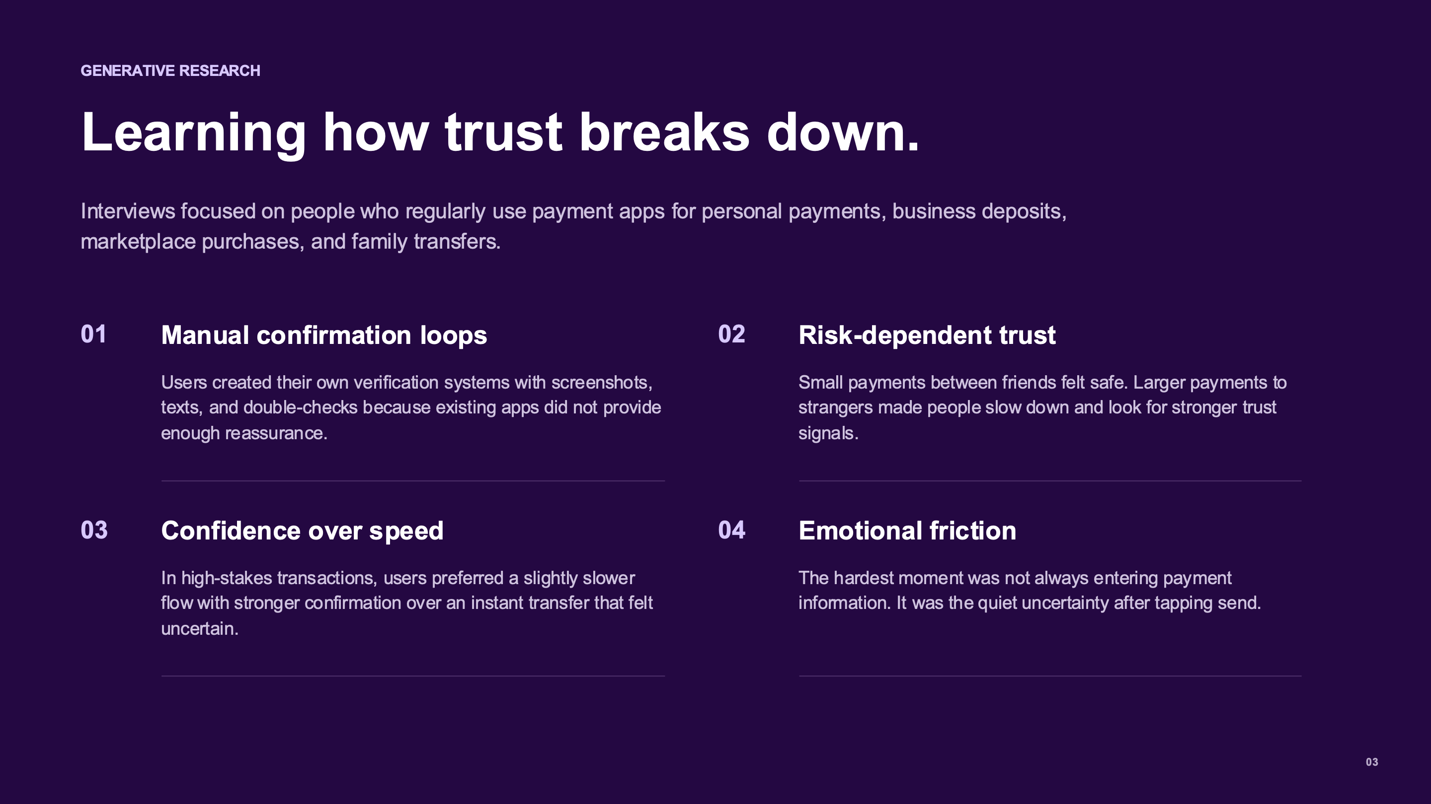
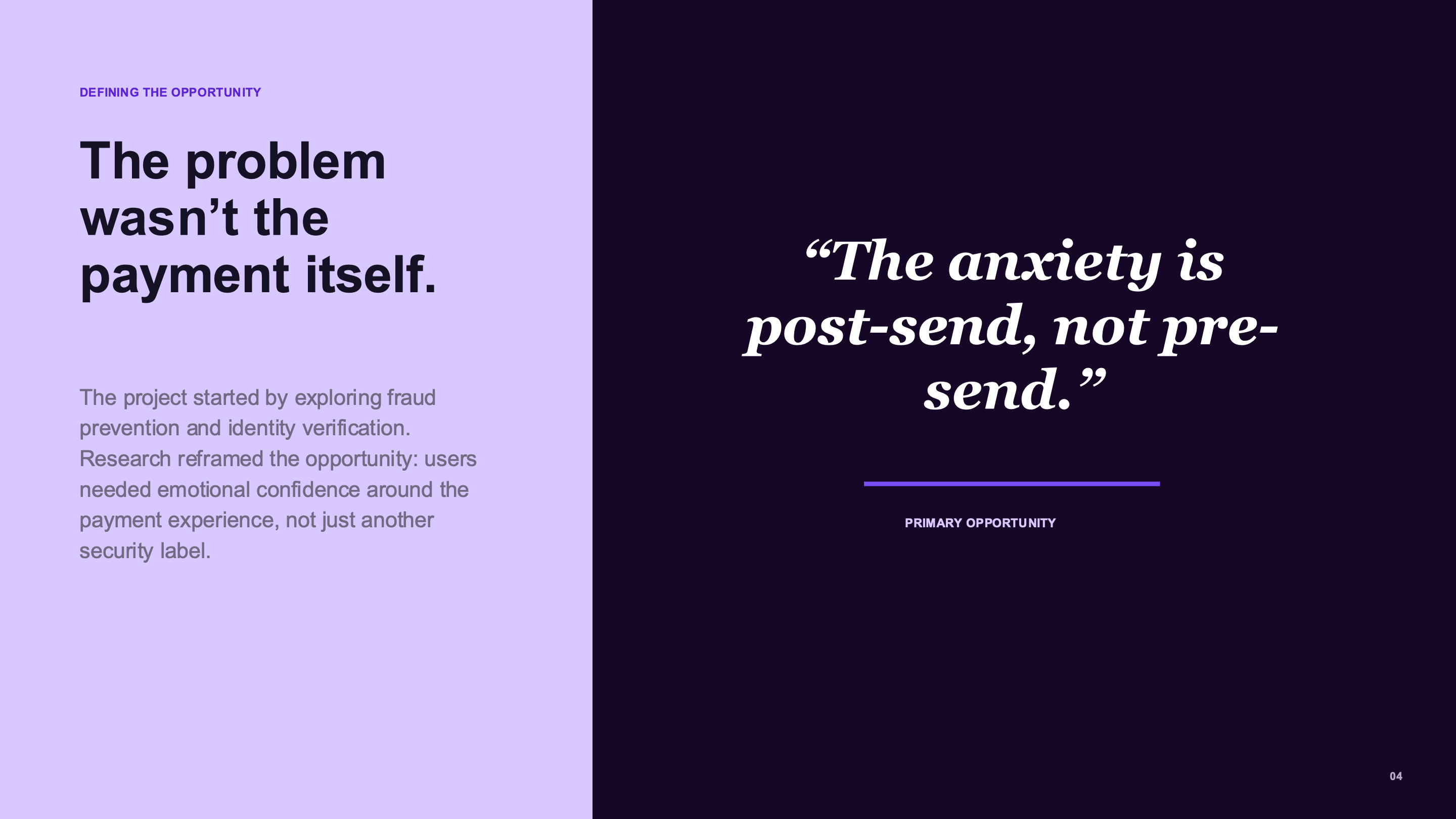
Modern payment apps move money fast, but people still feel anxious when the recipient is unfamiliar, the amount is high, or the transaction cannot be easily reversed.
02 · AI UI EXPLORATION
Same design system, different reasoning.
The same design system was used across AI tools to compare hierarchy, trust cues, and visual language.
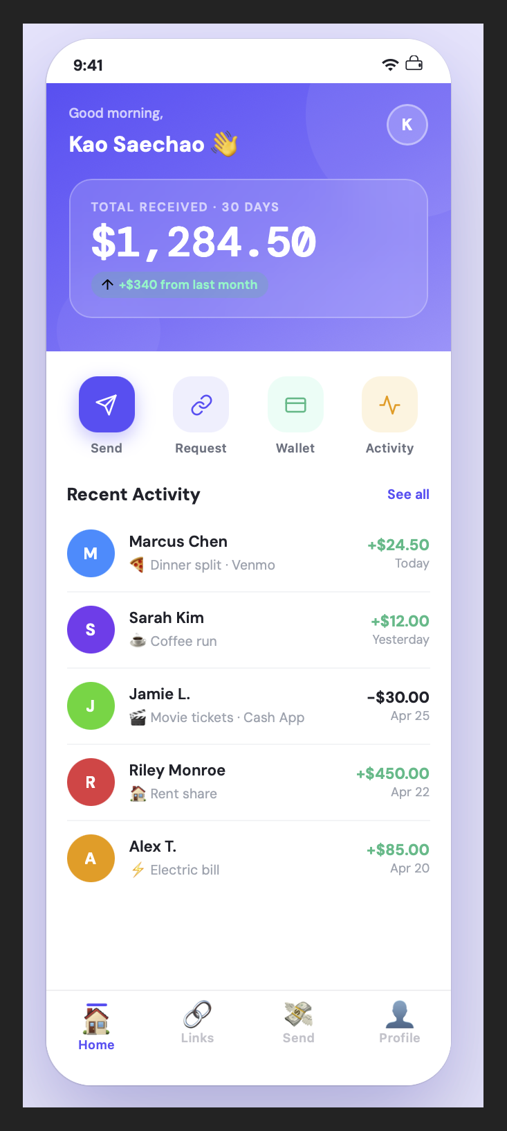
Claude
Strong UX reasoning and clean information hierarchy.
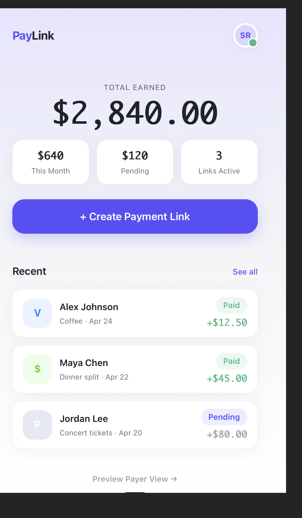
ChatGPT
Balanced layout and component structure with clear affordances.
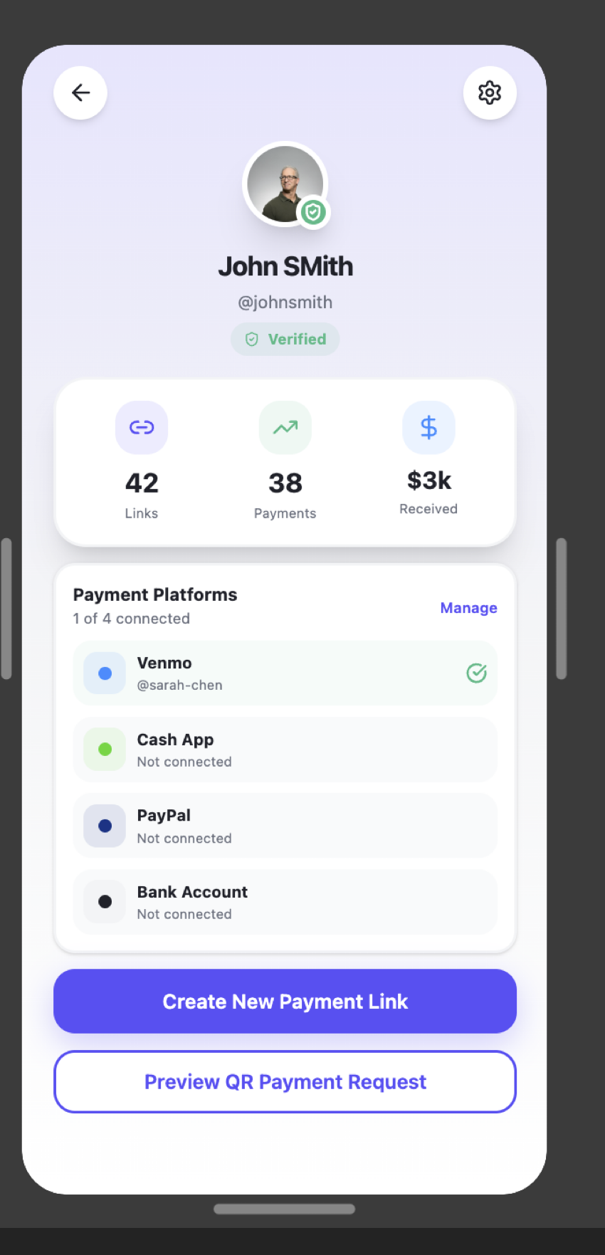
Figma Make
Visually polished and modern, with a stronger brand feel.
The comparison sharpened the final hierarchy without outsourcing the design decision.
03 · AI-DRIVEN ITERATION
Trust through clarity.
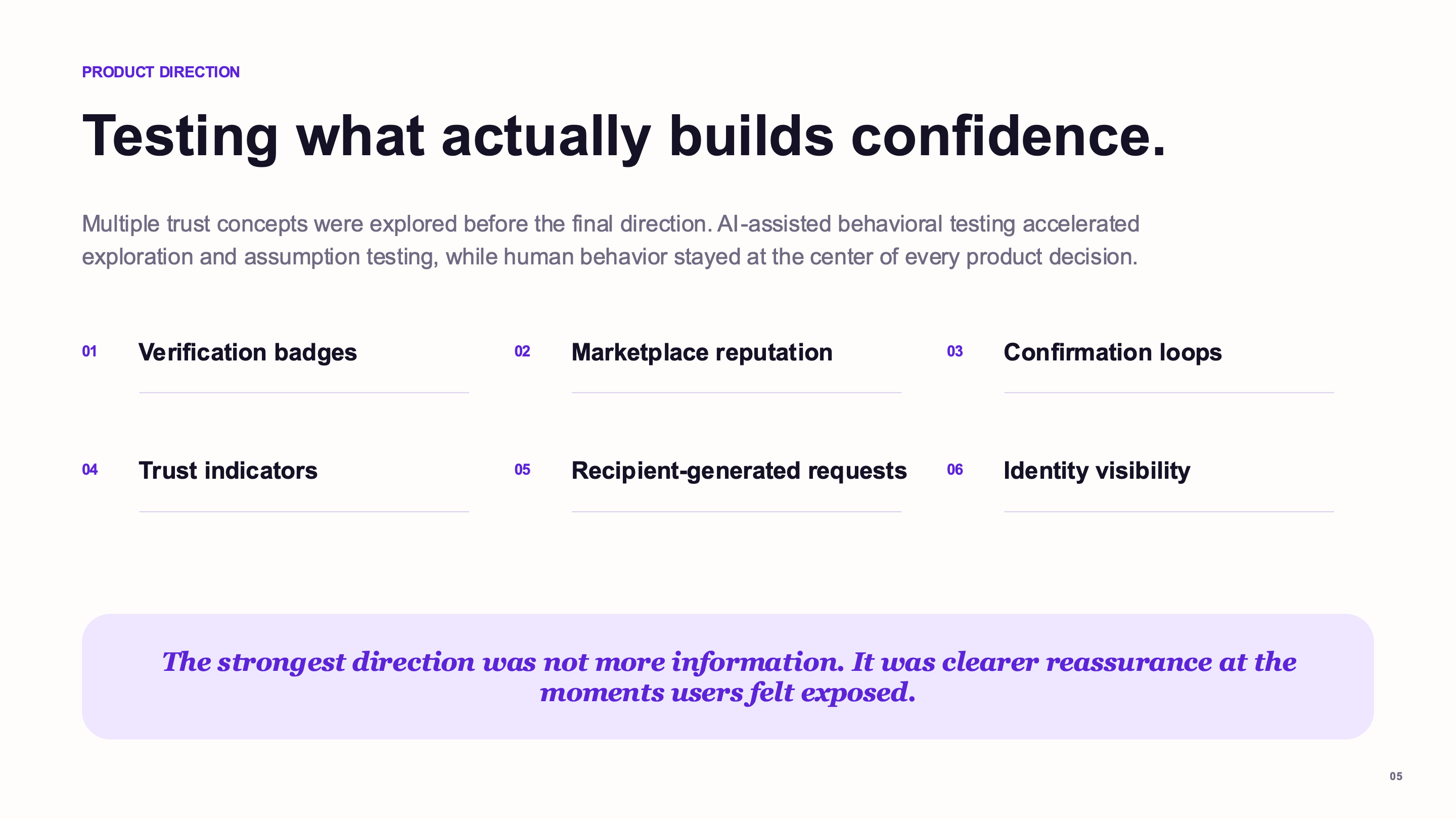
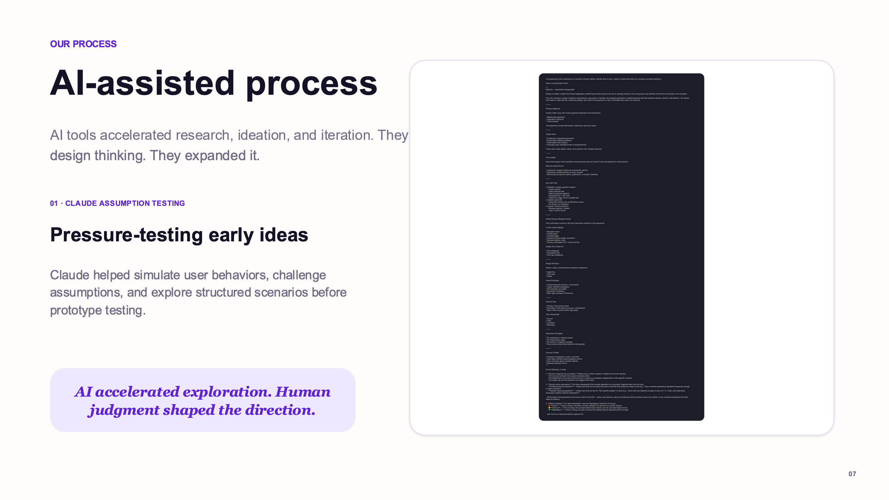
AI generated alternative flows and layouts. Usability feedback and research insights guided the final refinement.
BEFORE
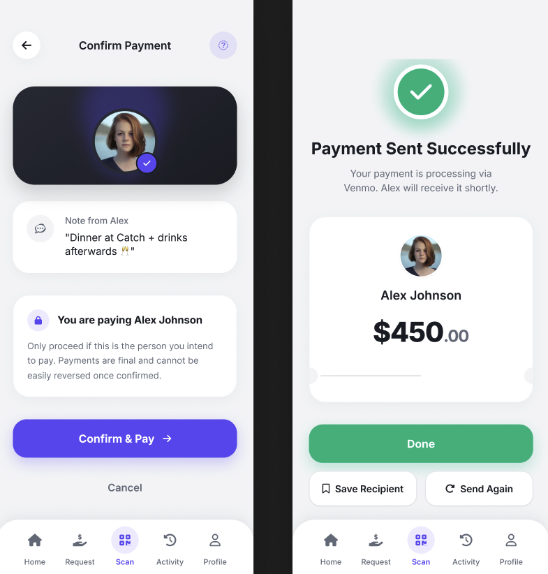
Overly confirmational
Too many steps created friction and increased cognitive load.
AFTER
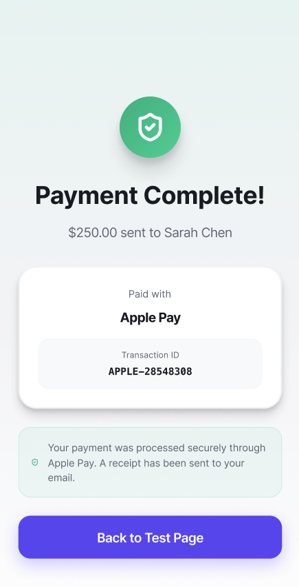
Trust through clarity
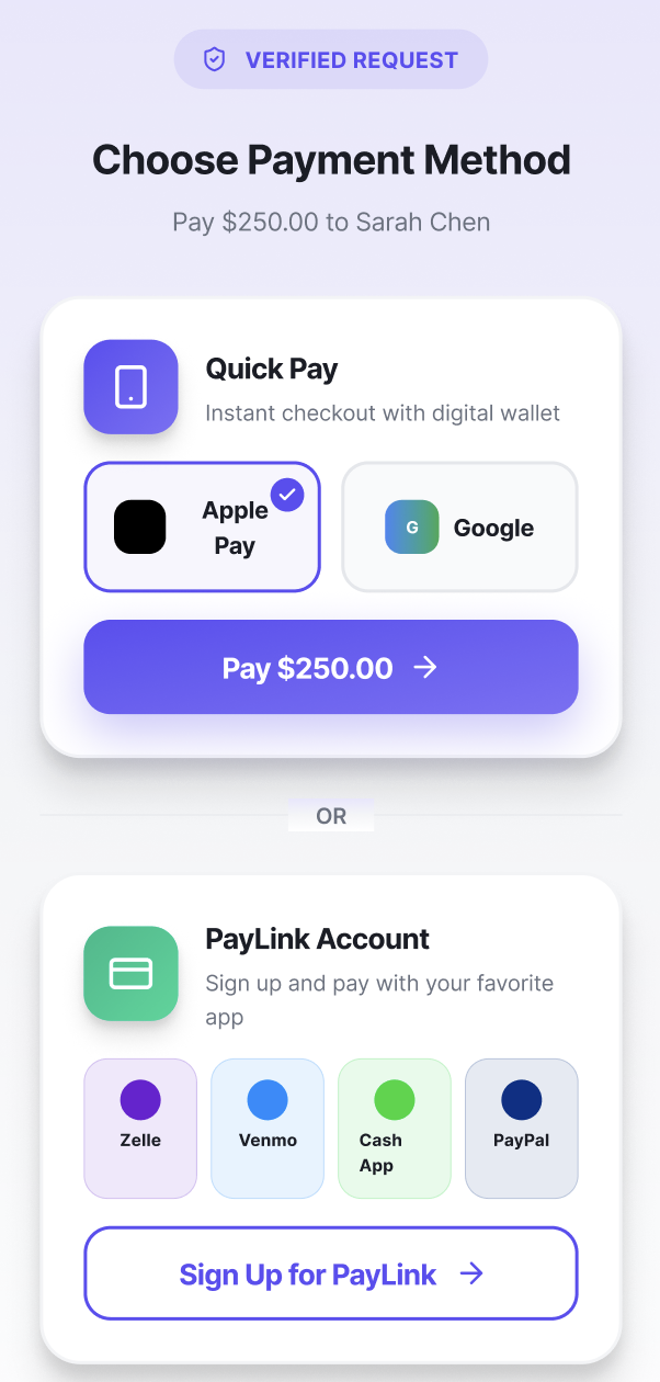
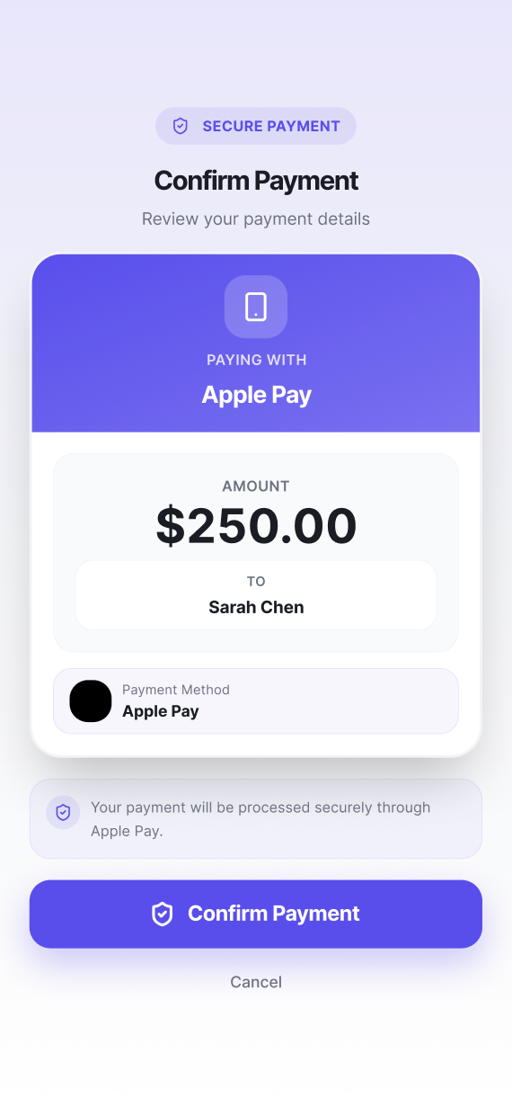
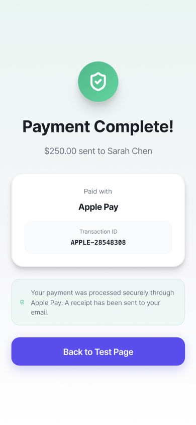
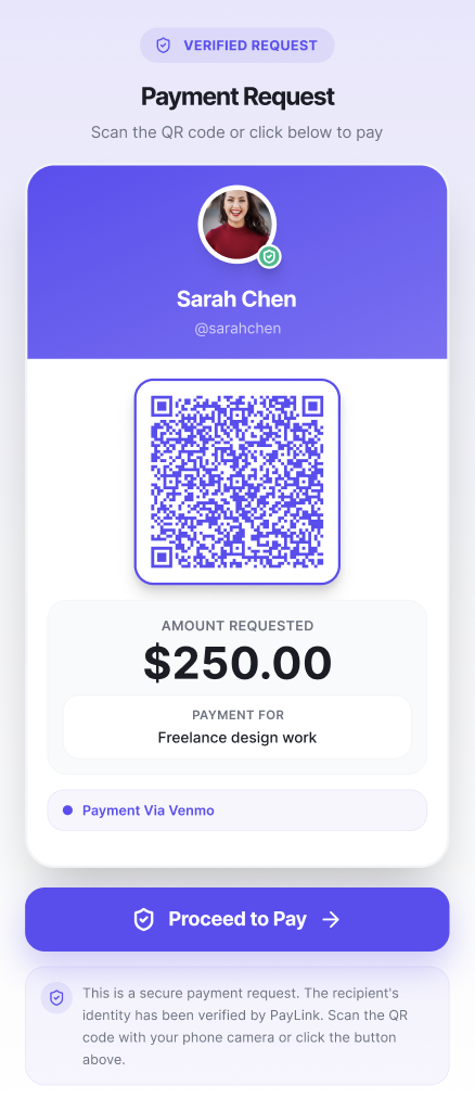
The revised flow reduced steps, surfaced identity earlier, and added clearer reassurance.
FINAL PRODUCT
Introducing PayLink.
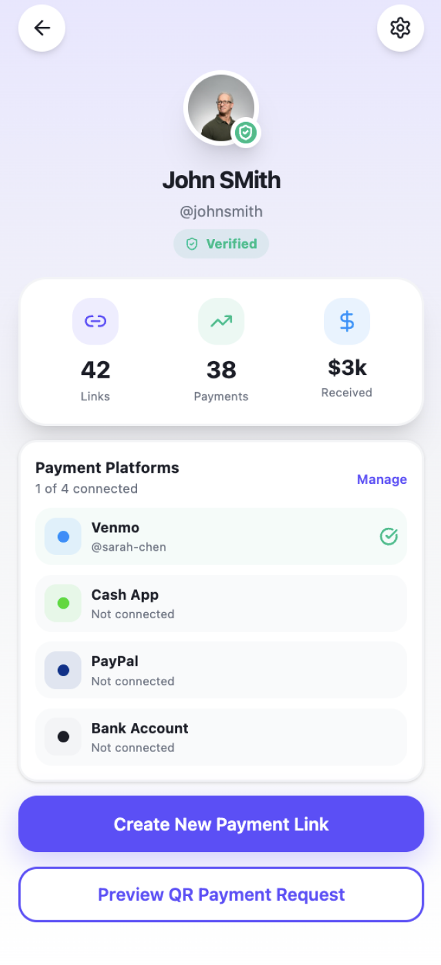
A lightweight trust layer for verified payment requests, recipient identity visibility, QR payment flows, and low-friction reassurance.